Winners of the 2022 Data Visualization Challenge announced
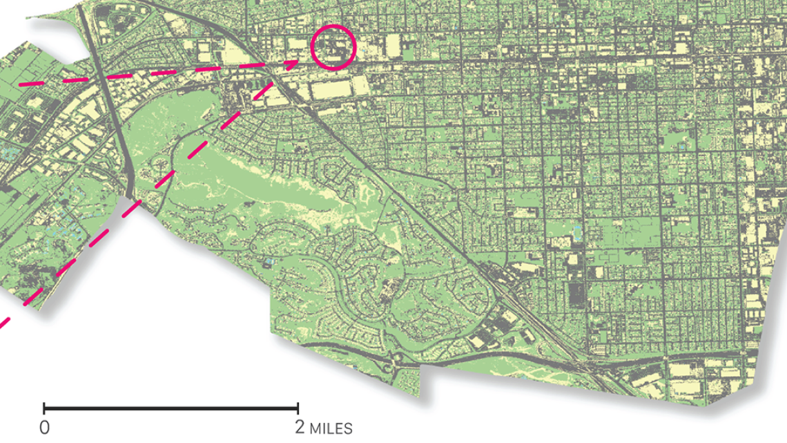
Irene Pineda's winning entry shows where trees should be planted to make a city more sustainable.
The University Libraries invited undergraduate and graduate students from different disciplines to submit visual displays of data to tell stories. We’re happy to announce the winners of the 2022 Data Visualization Challenge.
This is the third year that the Data Cooperative team in the Libraries' Research Engagement department has sponsored the event.
The winners received awards for first place ($250), second place ($150), and third place ($100). View the winning entries and access the digital collection.
"The Challenge is a way to celebrate the variety of ways that data can be visualized, and encourages everyone to think about how and why visualizing data is so important," said Geospatial Specialist Kiri Carini. "This is an opportunity for University of Arizona students to showcase their skills and build a portfolio of work."
Students who participated this year definitely agree.
“As a landscape architect student, one of our required classes was an intro to GIS,” said Irene Pineda, the first place winner in the graduate and professional student category with "Plant Trees in Pomona for a Sustainable Future."
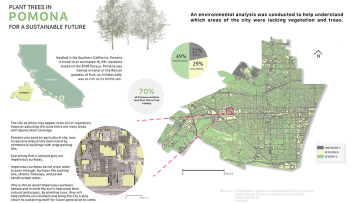
"My professor, Philip Stoker, was an amazing professor. He really took the time in walking us step by step on how to find, create, and eventually display data," said Pineda. "One of our projects for his class was to find a subject that was meaningful to us. My parents live in Pomona, California. It neighbors a beautiful city called Claremont. What makes this city beautiful is the amount of comfort, tree coverage. When I looked at census data, there was a difference in median income, education, age, etcetera. It was no surprise that the two cities are opposites. As a future landscape architect, all cities should have equal access to nature despite census data. As I continue to further my career, I now know the importance of looking at data and how to display it for members of a community.”
Riley Zuckert, the first place winner in the undergraduate student category, created a data visualization titled, "University Homework Costs Interactive Dashboard."
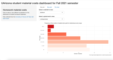
"I had collected great data on a personal project surrounding student homework and material costs I thought could greatly benefit the library's Challenge by showing off the exorbitant costs students must pay to, quite frankly, be able to do their own homework," said Zuckert. "What I learned [during this process was] time management in managing expectations for projects versus the reality of how much you can get done during a busy semester. Originally, I had a different visualization project in mind, but, unfortunately, that was going to require way more work than I had the capacity for at the time, so I had to quickly switch to something more manageable.”
“As I noted in my application, the data visualization I created was for one of my classes, Literacy & Technology (TLS 530)”, said Sarah Eggleston, second place winner in the graduate and professional student category. “We were encouraged by our professor, Dr. Jill Castek, to share our compositions with the Data Visualization Challenge. As a class, we were helping a fellow TLS grad student, Amanda Bermudez, with one of her research projects on sexual health. We were encouraged to bring our own design aesthetic and viewpoint to the project. My project is very "me" on this topic - no strong viewpoint, just balanced and presented in a lighter, not-so-serious tone. But the most interesting part of the challenge was the conversations it sparked. Educational researcher James Gee implores everyone to be life-long committed testers in understanding new perspectives. To see how classmates represented findings, beliefs, and viewpoints on this topic was fascinating. This project brought the ideas to life through my classmates' multimodal composition."
Dylan Girone, third place undergraduate said, “I chose to participate in the challenge in order to expand my programming skillset into MATLAB and during my previous coursework in remote sensing, I had chosen to exclusively use Python. One of my main takeaways from the assignment was that data visualization should be digestible. My original goal was to include the whole storm; however, the size of the data made this computationally and visually exhausting. I instead opted to focus on just the eye of the storm and the final product was much more easily understood and pleasing to look at, two of the main goals for data visualization.”
Bob Liu, User Experience Designer at the Libraries, was a member of the evaluation committee this year.
“The diversity and creativity we saw from those entries show that data visualization does not always have to be a specialized subject," said Liu. "Anyone can learn and have fun visualizing data.”