2024 Data Visualization Challenge winners announced
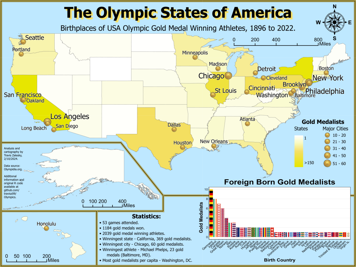
Travis Zalesky's 'The Olympic States of America' data visual won first place in the Graduate/Professional student category.
We’re happy to announce the 2024 winners of the annual Data Visualization Challenge, sponsored by the University Libraries’ Data Cooperative and CATalyst Studios.
Since 2020, undergraduate and graduate students representing a wide-range of disciplines have been invited to create and submit visual displays of data to tell stories. The data visualizations may include maps, charts, graphs, data art, and 3D models, but are not limited to these formats.
First ($250), second ($150), and third ($100) place awards for both student categories were announced this month. See the winning entries.
“The world really is awash in data these days, and it is our challenge as scholars to make meaning and extract knowledge from those data,” said Data Science Specialist and Data Cooperative Lead Jeff Oliver. “One important way of doing this is graphically displaying data to highlight salient points or conclusions.”
This year’s first place winners shared a little bit about the motivation behind their data visual entries.
Undergraduate student winners
Ben Ge, First place: ‘2021-2024 Tucson Auto Accidents’
“I was already building a data visualization portfolio in Tableau and thought this was a good chance to add another dashboard,” said Ge.
“I learned that finding good, interesting data to visualize was much more difficult than expected. I also found out how important, and difficult, choosing the right colors is for a visual.”
-
Travis Matlock, Second place: ‘Buffelgrass Green-Up Forecasted by Precipitation Events’
-
Katie Hefner, Third place: ‘Wardrobe Graph’
Graduate/Professional student winners
Travis Zalesky, First place: ‘The Olympic States of America’
“I love data visualizations. The combination of science and design inspires me, and I strive to make simple and informative graphics,” said Zalesky.
“I was excited when I learned of the University Libraries Data Visualization Challenge, and I wanted to use the skills from my Geographic Information Systems Technology classes to come up with something fun and interesting to a broad audience. I used this project as motivation to learn how to efficiently scrape large datasets off the web, and to practice my cartography techniques. I am thrilled that my submission was chosen, and I would like to thank my professors in the School of Geography, Development and Environment.”
-
Sarah Leighton, Second place: ‘How Service Dogs Benefit the Daily Well-Being of Veterans with PTSD’
-
Anik Das, Third place: ‘Crime Trend Around UofA Campus’
-
Partha Koundinya Panguluri, Honorable mention: ‘Tiger Terrains and Timelines: Visualizing India’s Tiger Territories’
The students at the University of Arizona are doing great work in this area, both in their classes and in independent research projects, said Oliver.
“This annual contest provides an opportunity to showcase the students' expertise combining quantitative analyses and aesthetic design for effective visual storytelling.”
Congratulations to this year's winners!