Customizing the new library search

Rebecca Blakiston, our User Experience Strategist, explains how listening to our library users helps us make their experiences better.
The project
We replaced Millennium and Summon with Alma and Primo in July as our library services platform and primary discovery tool. Needless to say, it’s a critical piece of the library’s experience. It’s the main way people find library materials (both digital and print), access full text, request holds, and manage their accounts. So checking and improving its usability is key.
The team
The focus of our (small but mighty) UX team the past couple months has been Primo. It’s critical, so we were all in.
We hired a grad student intern from the School of Information, Louis Migliazza, who focused his summer internship on Primo usability. That was awesome. Student worker Alex Franz and content and usability specialist Cameron Wiles took turns pairing with Louis for the testing.
We also met weekly for an hour with Erik Radio, our metadata librarian and product owner for Primo. He helped us come up with solutions and worked on the backend to make improvements, contacting Ex Libris when needed.
And we met weekly with the broader Primo implementation and discovery teams, which included stakeholders from throughout the library and were led by our fearless project manager, Joey Longo. At these meetings, we regularly shared our findings and gathered feedback on our plans to address them.
The methods
Louis and Erik’s leadership over the past 6 weeks made it possible for us to conduct a ton of usability testing and make significant customizations to the interface. Building on preliminary research and testing we’d started earlier in the spring, we ultimately tested 22 tasks with 91 participants.
We used Tiny Café (our pop-up food/drink station in our Main Library lobby) to recruit passersby for testing, who were by and large undergraduate and graduate students. We had a handful of library staff stopping by, too. We did this on Tuesdays and Wednesdays for two-hour blocks (4 hours a week total). Ultimately, we held 27 hours of Tiny Café, intercepting 84 passersby.
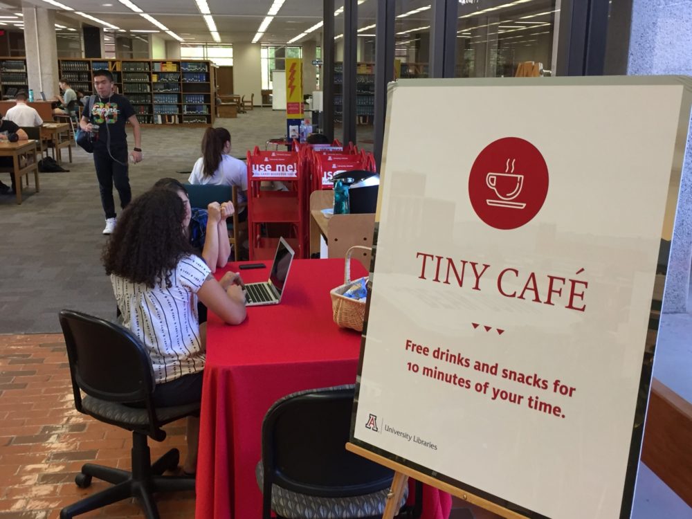
Tiny Café
We’d usually test 2 or 3 tasks per participant. And the tasks changed nearly every week as we learned what we needed to learn, made adjustments to the interface, tested again, and/or moved on to the next tasks we needed to test.
We also recruited faculty with help from our liaison librarians. The majority of those sessions were lengthier, moderated, remote tests using Zoom.
All told, participants included 36 undergrads, 31 grad students, 7 faculty, 7 library staff, and 10 community users.
Findings
Searching and filtering
Participants were 100% successful at:
- Finding a specific item by title
- Searching for journals by topic or title
- Renewing an item
One grad student said, “Looks pretty intuitive, pretty easy to navigate.” And one undergraduate said, “I think it’s easy to find what you’re looking for.”

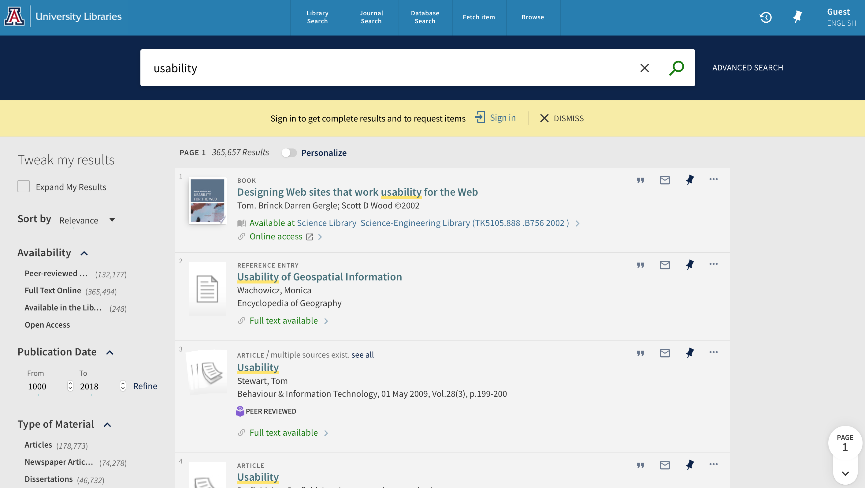
Original Primo basic search interface, where participants would start their search
They were mostly successful at using filters, specifically:
- Using facets to narrow results (84% success)
- Finding an item at a specific library (83% success)
Some of those who weren’t successful would only use the search box to narrow their results, avoiding filters entirely. Or they would skim through their results to try and find an item like what we were describing. (In our scenarios, we intentionally didn’t ask them to “use the filters” to avoid leading them in that direction. Rather, we asked them to “narrow your results to only books from the last ten years” and “find a book that’s in the Health Sciences Library.”) That said, we did make a number of changes to our filters along the way (described later on), hopefully making them a bit more useful.
Original Primo search results page, without customizations
Signing in
We observed some issues with signing in, too. Only 83% of people successfully signed in to see the due dates of checked out items. To address this, we changed the language in the top-right utility navigation from “Guest” to “Sign in/account.” We also removed the word “English” along with the language options, which caused confusion (and disappointment, since Spanish wasn’t an option and we’re a Hispanic-serving institution).
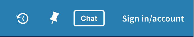
Customized utility navigation
Saving items
Interestingly, only 2 of 8 students successfully saved an item to their account. But then 4 faculty and PhD students were successful on first attempt. This might tell us that undergrads don’t tend to think of or use this feature. It doesn’t fit with their mental model when it comes to saving articles.
When asked, they said they would use other methods outside the tool, such as bookmarking the URL or emailing themselves. We didn’t make any changes to the interface based on this, but found it interesting.

Only faculty and PhD students were successful in using the pin icon to save their results
Requesting items
The most challenging task was requesting a hold. Only 40% of participants were successful. This is because you have to be signed into Primo in order to see the “Request” link. If you’re not signed in, the option doesn’t appear. We ran a subsequent test where we were already signed in, and 100% of participants were successful.
By default, Primo has a yellow bar that says “Sign-in for more options,” but people didn’t notice this most of the time. Especially since it’s in the “View it” section of the records, and people tend to be looking near the “Find it” section.

“View It” and “Find It” sections of Primo item records, without customizations
We found it problematic that the interlibrary loan option appears when not signed in, but the hold option does not. In contrast to requesting a hold, 90% of participants were successful in requesting an interlibrary loan, using the link: “Borrow this item from another library.” By requiring users sign in, the interface essentially hides functionality from the user, causing a significant usability issue.
Ideally, we think, the “Request” link should always appear and upon click, the user is prompted to sign in. (This is how our catalog worked). But with this not being possible, the only thing we could really do is customize the message. So we changed it to say: “Want to place a hold? Sign in.”
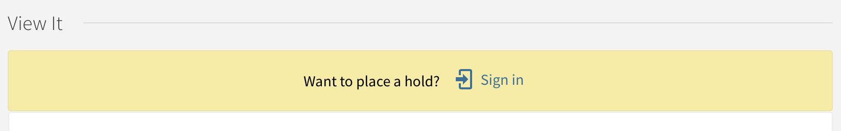
Custom text to indicate people need to sign in to place holds
User impressions of usability
A few weeks into our testing, we decided to add on a System Usability Scale survey after each session to gather overall impressions in a more systematic way. Of the 32 people who filled it out:
- 89% thought various functions were well integrated
- 84% would use Primo frequently
- 83% thought most people would learn to use Primo very quickly
- 78% think Primo is easy to use
- 70% were very confident using Primo
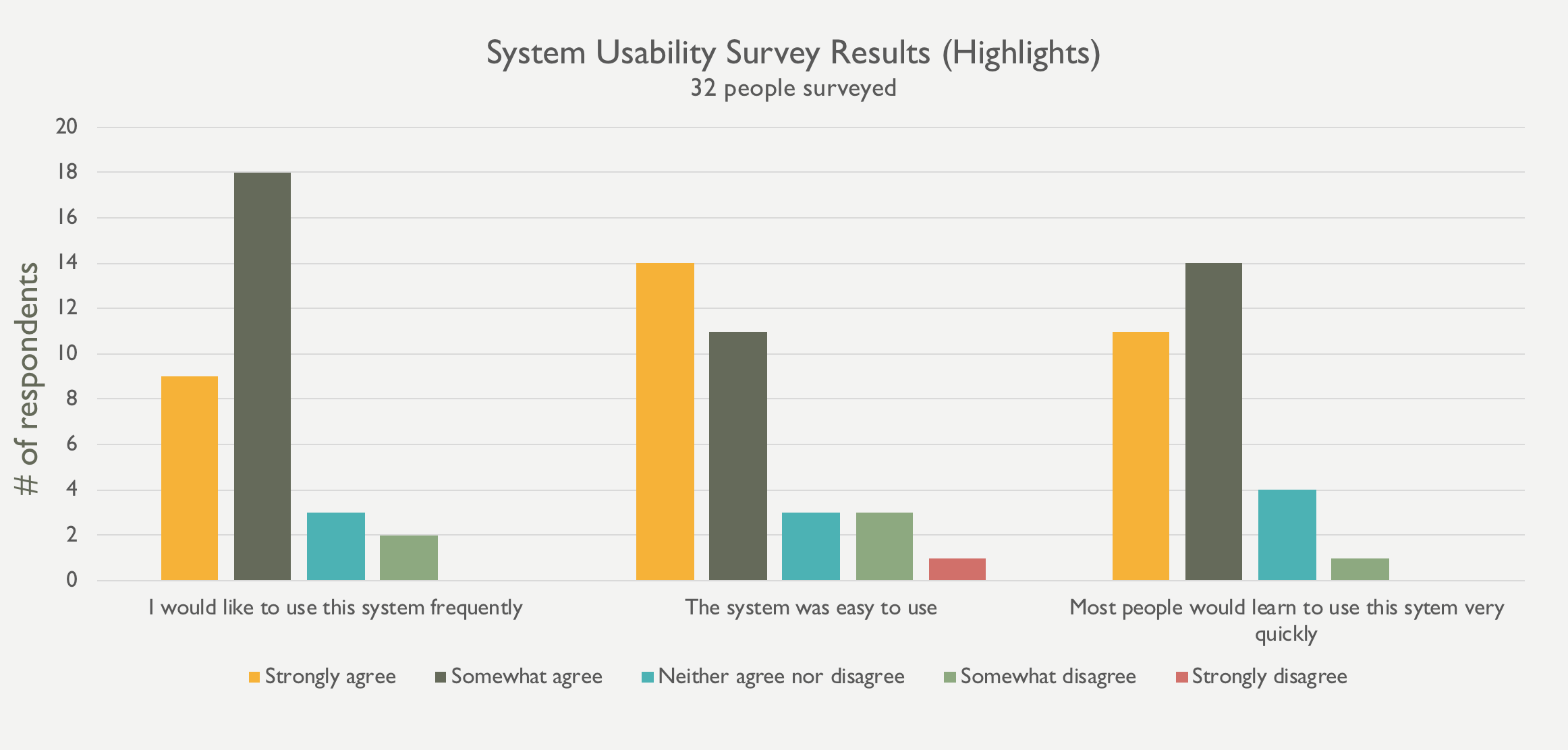
Needless to say, we were pretty happy with these numbers.
Other customizations
Changing terminology
We found that some of the default terminology wasn’t ideal. For example, one grad student said, “Loans? I think about money…I just don’t like the word ‘loans.’”
Here are a few terms we updated:
- Item in place > In library
- Full text not available > Available to request
- Fetch item > Find a specific item
- Expand my results > Include results beyond UA Libraries
- Loans > Checked-out items
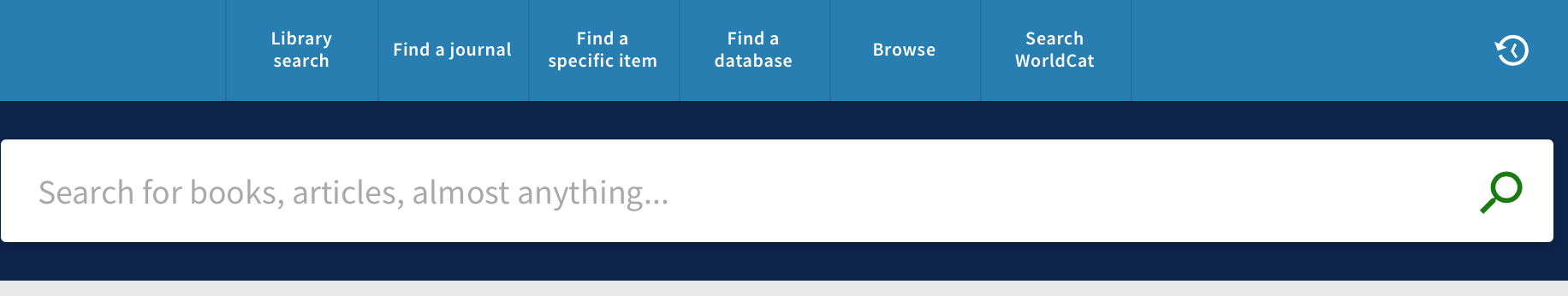
Updating the homepage search box
To mimick existing Summon and Catalog options while focusing on the most common search behavior, we:
- Created drop-down options for title, author, and call number
- Put an Advanced search link in the bottom right
- Added buttons to take users to the most common alternate starting points: See all databases and Find a journal
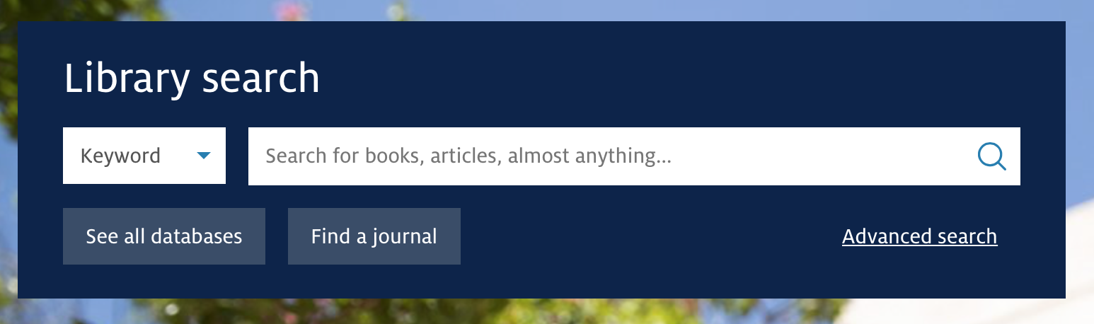
Simplified homepage search box
Removing less helpful or redundant elements
To make things as intuitive as possible, we:
- Removed the vendor product name
- Removed the sign-in banner for users on campus
- Removed redundant title attributes from the tile menu
- Removed Personalize option (redundant with subject filters)
- Reduced and re-ordered the Send to options
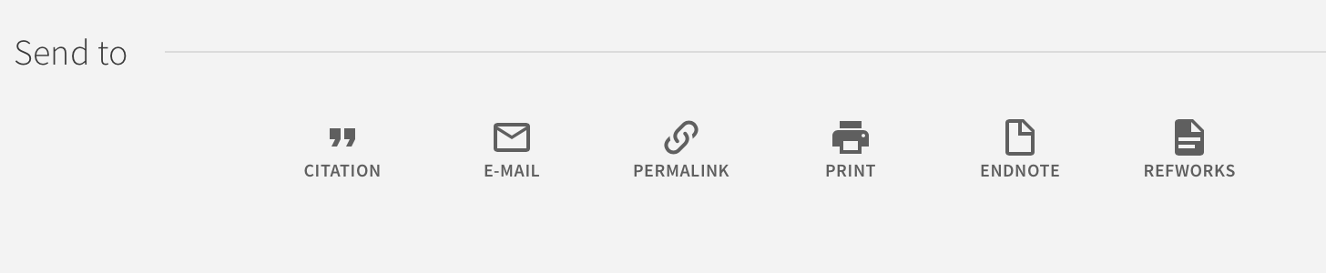
Customized “Send to” options and ordering
Making search results and filters more intuitive
To reduce cognitive load, we:
- Moved filters from the right to the left
- Re-ordered filters so that the most-used options are at the top
- Changed “Availability” to “Show only” as a filter category
- Customized the icons to be more consistent and recognizable
- Removed filters that were confusing, less useful (e.g. “Call number range”), or redundant (e.g. “Location” in favor of “Library”)
- Reduced number of items displaying by default underneath each filter category
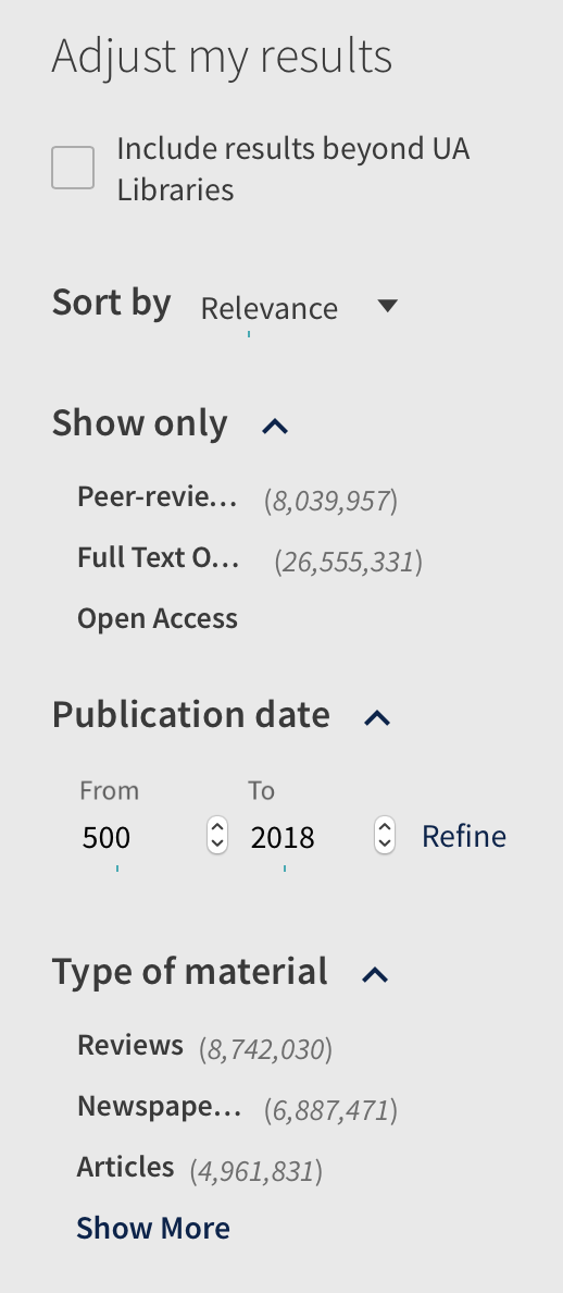
A preview of our filter customizations
![]()
Customized icons for book, article, and multiple versions
Putting content at point of need
To help users along, we:
- Added a Locate button to print records that takes people to the call number guide
- Put searching tips below the Advanced search option as well as the Library search landing page
- Added suggested librarians for when people search particular disciplines
- Added a link to WorldCat above the search box
Customized primary (tile) menu
Next steps
This is a huge change for our users, but we’re feeling pretty good about where we’re at. We did a lot of testing and a lot of tweaking, and participants were overall successful at completing the primary tasks we’d identified.
We went live on July 20, and are already discovering more UX concerns now we have people using the system in their daily lives. We’ll continue to gather feedback and make adjustments as needed.
Perhaps one undergraduate said it best: “I think I liked the old interface better because I’m comfortable with it…I’m sure once I get used to it, it will be ok.”
Read more staff stories to get to know the people behind UA Libraries.